


by Elijah Bonde
As a school leader of a small school, we are tasked with wearing many hats. One hat that is asked of school leaders, both as a best practice and usually as part of accreditation, is using data to inform decisions. Unfortunately, we are not trained in practical ways to do this for our schools. I stepped into the principal role after being a teacher. I was not trained in effective ways to use data to lead my school. I had to learn on the job how to analyze data, share the story of our data with my teachers, Board, and community, and also lead change initiatives identified through the data.
I hope to share some of my lessons learned with making data meaningful and productive for my school community. We will review some important reminders when looking at data, how to share it with the different stakeholder groups in the community, and ways to begin making change with the data you reviewed.
Data Analysis
As we begin looking into data, we must make sure we are framing our thinking to make the discussion productive. If we enter into data analysis to try and prove a point or confirm a judgement, the data review process will be negative and destructive for the school community. We have to come into the conversation with a focus on learning. When we get information from the data, we have to ask questions and wonder about what it means for the system. Don’t make statements or judgements.
Set a Benchmark
The most basic place to begin with analyzing data is setting a benchmark. Having a set benchmark allows you to ask questions about the effectiveness of the programming being assessed. Without that initial measure, the data does not inform us about the programming we are analyzing. When beginning a new assessment, setting an estimated goal is important. Although I often resist setting a specific number for new assessments, I have found it quite useful. My resistance usually comes from my lack of knowledge of what a “good” score will be. I want to gather more information first, then set the benchmark. By setting a benchmark beforehand, I can create a comparison against my intuition for that assessment. Since we are framing our thinking in a place of learning and wondering, being off on my benchmark is not negative. It adds to the understanding and wondering that happens in the analysis.
Continuing to Explore
After holding the results up against the benchmark, and possibly adjusting the benchmark level if necessary, lock in the number. Then as you review data from year to year, you can have some longitudinal comparisons on the growth of school. This long-term lens on the data becomes highly useful for understanding the development of the school in connection to school improvement processes.
Looking at significant subgroups is also very useful. Not all data sets align themselves well with disaggregation, but there can be a lot of valuable information by looking at the subgroups in the school community. My school is particularly small in our student body with roughly 65 students. We are pretty homogenous in our demographics as well with around 90% Latino, 90% ELL, and 90% low-income. This makes it hard to disaggregate by ethnicity when the numbers of the subgroup are so small. But in our school climate survey, which we give to students, parents, and staff, I am able to disaggregate by each of these subgroups and gather valuable information about that subgroup's perception of the school.
Sharing Results
After doing a basic analysis of the data, you should have some initial thoughts about the meaning of the data for the school community. When we have begun to move from wondering to knowledge, it is vital to share that knowledge with others. By sharing our understanding of the data with the community, we can receive feedback that will either validate our initial understanding or challenge that perception of the data. As the school leader, we have to enter into that conversation open to the dialogue. We are not trying to prove our point, but learn with the community.
Visualizing
One of the most useful tools in sharing data is the ability to visualize the data in an easy way for others to make sense of the data. Simple, clean charts with informative labels is how we create understanding for our audience. I personally like to take data out of whatever pre-generated report the system uses and make a simplified version of that report that I can share.
Something that is important to keep in mind when creating self generated visualizations, is the initial impression that the data gives to the audience. Figure 1 does a good job of sharing a lot of information in a quick easy way. We can see the number of students and how they performed in all three grade levels and on two tests. The downside of this visualization is the color choice and structure makes the data look very bad. Presenting this to the community will result in an automatic panic. I learned this the hard way that the impression the visualization gives is just as important as the data. Now, I use the visualization in Figure 1 for my own understanding, but share data with the community in styles similar to Figure 2. The colors in this visual are mixed and vibrant, and there isn’t an initial negative perception. This allows the viewer to take a second to understand the data. It forces them to wonder what it means rather than jumping to a conclusion.
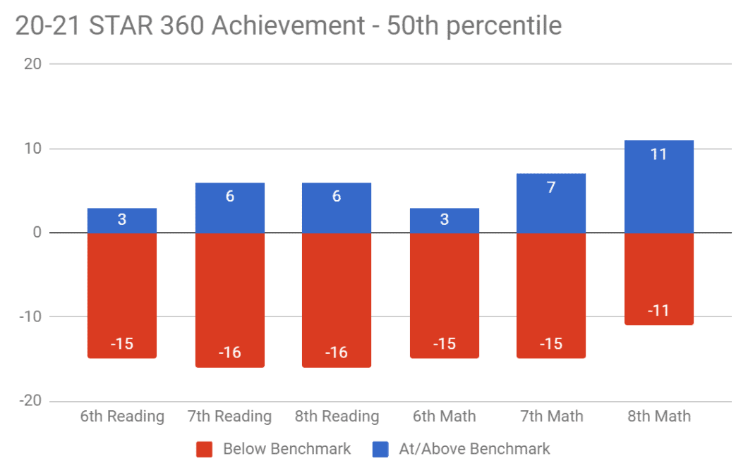
Figure 1: Self Generated Report on 6th through 8th grade Achievement
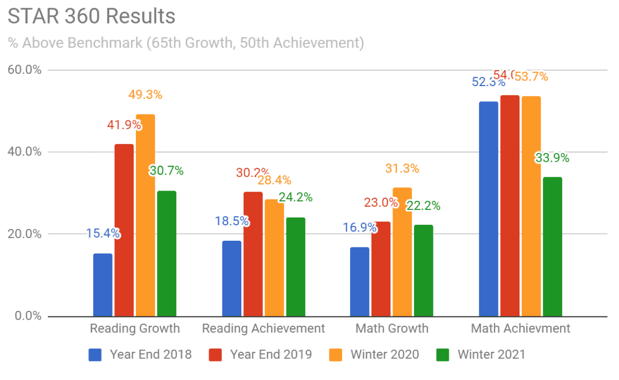
Figure 2: Self Generated Report on Percentages Above the Benchmark Longitudinally
Facilitating the Discussion
Once you have the visualizations prepared, you can begin to design your presentation to the stakeholder groups. Based on initial impressions, you will need to consider how to design your presentation. If the data is positive, it is easier to present simply by showing the data and asking for impressions. If the data is mixed, negative, or more complex, some more intentional design might be needed.
Some ideas for design might be including an article to read that is relevant to the assessment that also frames the data. For example, at our school we look at college graduation rates for our students. We have a nearly 40% college graduation rate. Initially this seems low, but given that we work with a 90% low-income population, this number is actually very high. So, I may give an article to my community that explains that the overall college graduation rate is only around 50% and for low-income students, it is closer to 15% (College for America, 2017). This reframes the way my audience will receive the data.
Another strategy might be pre-framing the discussion. In a recent presentation to my Board, I wanted to show the student achievement data in Figure 2. It is easily apparent that the pandemic has impacted our students’ performance. I wanted to make sure the Board understood the context that informed the data before they panicked. I shared my initial understanding with the Board prior to showing the data, then invited their analysis. I made it clear that I wanted to hear their understanding of what they saw, which allowed for a meaningful learning conversation.
The other strategy that can be used if the data is going to highlight the need for change is a facilitation strategy called the Three-Box Solution (Govindarajan, 2016). In a three-box facilitation, we set out three boxes (literally or metaphorically). The first box is the largest and focuses on what the system does well. So in a data analysis facilitation, what’s the good news of the analysis? What are the aspects of the school program that are working, even if they don’t show up in the data. This frames the conversation to be positive. The second box is smaller than the first, but focuses on what needs to be let go of or changed. This is where we can allow for the negative or worried observations of the data. After capturing both of these boxes, our third box is the future. What actions can we agree to because the data is pointing to it. Using this structure makes it easy for us to recognize the good work being done, acknowledge the areas that need to change, and set direction moving forward.
Leading Change
If we don’t make change using the data that we have analyzed, then we are doing a disservice to our communities. We must use the data to inform our practices both at the classroom level and at the school level. When considering change, I try to distinguish between the short-term and long-term changes that will be coming. Both are essential, but need to be addressed in different ways.
In the Short Term
Often when we look at data, there are signs that can help us improve student learning in the immediate. If I give my standardized test that has a standard mastery report, I can get information that will inform grouping in class, the importance of reteaching high leverage standards, or intervention groups that I might need to form. These quick changes can benefit our students in the immediate.
Developing a Long Term Plan
The data can also be used to inform our school improvement plans. Be it, a school accreditation action plan or school strategic plan, we can use the data to inform how we are growing as a system. One example of this in my school was related to our English Language Learners. We did a round of English language proficiency testing and analyzed that in relation to our standardized reading test. The results highlighted for us the importance of supporting our ELLs with a systemic program. This was reaffirmed by our accreditation visiting team. While we implemented some immediate, short-term practices, such as having word walls and using some structured language practices, we needed to have a plan to improve our systemic approach. This plan took some time to develop and took years to implement.
Conclusion
While there is much more to having a full data system, this is some important starting place. We have to begin the practice of systematically looking at our data, making sure we frame our thinking into a place of learning, co-create our knowledge with the community, and take action. These cornerstones of looking at data can get a school leader far.
References
College for America (2017, July 7). Addressing the College Completion Gap Among Low-Income Students. Southern New Hampshire University. https://collegeforamerica.org/college-completion-low-income-students/
Govindarajan, V. (2016). The Three-Box Solution: A Strategy for Leading Innovation. Harvard Business Review.
The Author
 Elijah Bonde is the principal at Nativity Prep Academy in San Diego. He began working at NPA in 2005 as an AmeriCorps volunteer. After completing his MA in Leadership Studies from the University of San Diego in 2015, Elijah moved into the principal role and has worked to guide the school as it transitions into being a 21st century learning environment with a focus on improving data analysis.
Elijah Bonde, Principal, Nativity Prep Academy, 4463 College Ave., San Diego, CA 92115, 619-544-9455, [email protected], Twitter: @ElijahBonde, LinkedIn: @elijahbonde
The School
 Nativity Prep Academy is a private, Catholic middle school for low-income, first-generation students. We work with students on a daily basis in grades six through eight with a focus on preparation for high school and college. We focus on developing meaningful, life-long relationships with our students to support them in their academic journeys. We continue supporting the students in high school and college with the goal of a college degree for every student.